Ash - Cm12.1/12 Theme
What's Themed :
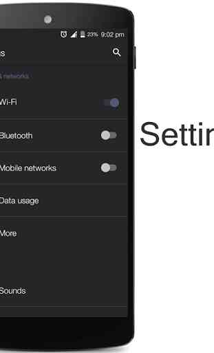
* Setings
* Dialer
* Contacts
* Calculator
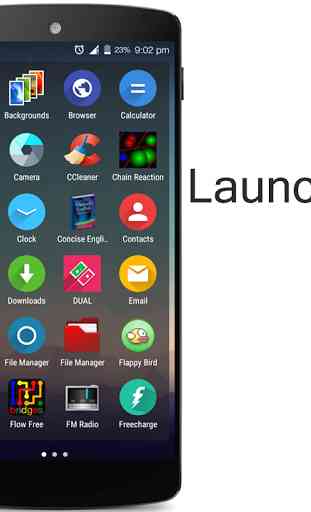
* Launcher Trebuchet
* SystemUI.
* Lockscreen
* Notifications
* Dialogs
* Fonts
* Alarms
* Notifications
* Ringtone
* CM File Manager
* Aosp Keyboard
* System Wide Navigation Bar
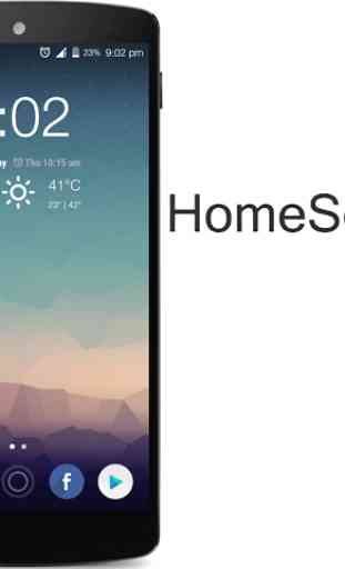
* Wallpapers
* Quick Settings
* Cyanogenmod Music
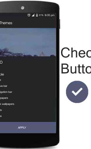
* Cyanogenmod Theme Manager
* Icons*Google Apps*Many More
* Support for various Custom roms based on CM12.1/12.
Install the theme and feel it yourself. Your phone has been reborn. It has been minded already to provide you the best out of your phone. It is simply elegant.It supports upto multiple resolution devices.
You can support my development by buying the donate version of Ash here,https://play.google.com/store/apps/details?id=se.balraj.XeroAshDonate Please give feedback without hasiting, I'll improve on my bad sides.
Note :
After every update please reboot the phone to make sure it works properly.It works perfectly on stock CM12/12.1. If you face any element unthemed, its totally of a custom Cm12.1/12 based rom. Please report me about that I'll integrate it ASAP.
Every update will bring something new, so give a try it worths.
Category : Personalization
Reviews (26)
The theme works just fine. the buttons, icons, simplistic layout and the edgy font improved the usability of the device. the color inversion in some applications is too good. i was adamant on rooting my device and get the MIUI CMA but your theme came as a saviour . The design simplicity and performance gives it an edge over the overpriced gaudy- humongous themes in the store I was hoping if you could bring the much anticipated MI4I UI packed in a compact theme for CM12.
I love the theme! Reason for the low rating is because there are two issues I am currently facing. 1st is the dial pad... Its missing the 'call' button (so I can dial the number but can't call bc icon is missing). 2nd when I'm in a call with someone and I select my number pad half of the aren't showing up unless I scroll up and when I do scroll up and release to press a number it scrolls back down in a blink of an eye. Btw I am using a OnePlus One running cm12.1
One of the best, free CM12 themes I have ever tried out.
Love the theme overall. Just one thing needs tweaking: latest OTA for CM12.1 on OPO has introduced a new dialler. Call button is totally black on black. Maybe if Whatsapp could also have a dark background colour...:)
I love the combination of darkness and grey! It works great together and looks good sleek. Using the theme on both my Nexus 7 2013 and OnePlus One running Euphoria OS because I like it that much. :D
A nice theme that has a dark style but not completely black and its free. I definitely recommend this theme.
Very nice theme... But plz bring back the divider lines and make the secondary text a little bit more bright. And the sound panel buttons in power menu aren't properly themed.
Gorgeous rounded corners on notifications. I prefer a more standard look for styles and use Elixium there.
Some letters or numbers not clearly seen because of the black background. Need improvements on google play store some words are not in place and hardly to see them. But i like it. :)
The nav bar is totally out of place. It has a little bit thin icons. I'd rather have the standart triangle-circle-square layout. But everything else is amazing. Especially the gunmetalish accent color :)
Some window or dialogue boxes, has text same tone with background. Please fix
I know it's COS specific but would be nice if the gestures sub menu was themed. That is the only thing I have noticed that could be updated
I just installed this theme and is really good... The things that are not appropriate are the background for Google play and the font when you search the recent contacts... both are black and you don't see what you write or the different app blocks.. Please can you fix this... Thanks
One problem: its hard to differentiate between tapable and untapable buttons in app info page.
In play store .. The number for the star rating off apps has almost the same font color as the background .. Makes it very difficult to see clearly.
Please change the color of the progress of a activity in status area, as it is difficult to read black-on-black. Also, Facebook app is looking wierd. Otherwise, a fantastic theme!
But in the drop down menu it's really hard to see the toggles for data etc. and some OK buttons really hard to see specially in sunlight. Other than that, real good so far
I've thought my play store were error because i didn't see the score
Don't forget to update the Google logo in the play store search bar! Just noticed the old logo on the landing page. And the Helvetica Neue looks sweet, but some text gets cut off in certain places, maybe throw in a condensed font for some things?
please use white for your font colour since you're using black as background colour. barely see the word for some app (eg: google now and quick action on notification). i love all about this theme except the font colour. please change/fix this. thanks.
Love it. It's my daily driver theme. Stable, beautiful and complete. A few white text on white background issues here and there, but overall very excellent.
I love this theme but, can not open contacts Contact does not responding when on the run
I love this theme! But the facebook app and power menu is a bit broken, but everything else is perfect :)
.. The menu is white with white font, it's unreadable Using cm12.1 in oneplus one
The "all apps" icon is different than shown in the preview image of home screen shown here.. And how do I change keyboard background to black ?
Its a fantastic look for my OPO and I love it. My only issue is that there isn't support for as many of the more common apps like snapchat or avg and even maybe the office suite. Either way though, these don't really ruin the theme, they just are slight annoyances for me