Barometer Reborn 2017
Monitoring of atmosperic pressure can improve your life
- people suffering of migraine or headache can monitor how barometric pressure impacts on their overall mood
- barometric pressure is important for fishermen
- you can adjust your fishing technique according air pressure trend to get best results
Features:
- nice and modern material design
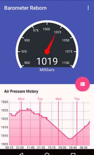
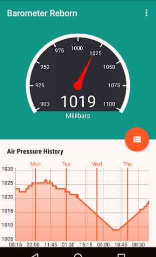
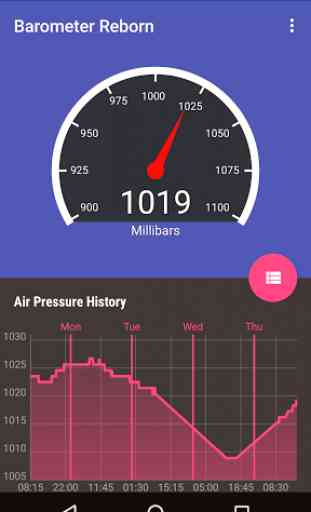
- shows current atmospheric pressure according info provided by your phone sensors
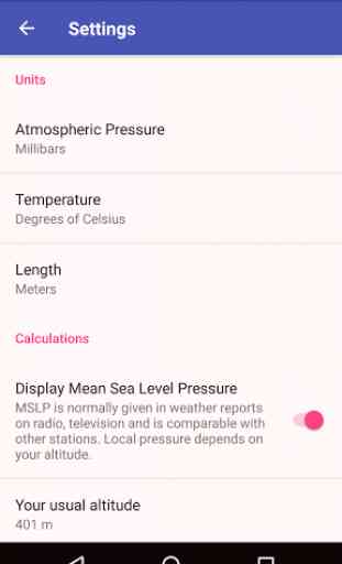
- supports multiple units: millibars, hectopascals, inches of mercury, torrs and milimeters of mercury (more units to follow)
- supports mean sea level air pressure (to be comparable with other barometric stations)
- trackss history up to one week
- simple widget for your home screen
- fully free: no ads, no payments
Using this app is easier than using aneroid or mercury barometer as it tracks history and can be calibrated to mean sea level air (MSLP).
Please note that some phones don't have barometer sensor so they are not compatible with this app.
Category : Weather
Reviews (11)
Update 3/22/2022. The ad is HUGE! It takes up most of the chart area so you have to scroll down to see the activity. I guess they want to force people to buy the app. It used to be helpful for quick viewing. If the ad were at the bottom then it would be fine. I'm deleting. Again. It's a really good app. But for those who need it for health reasons, it isn't as useful anymore. Update 2142022 I hate the huge ad right in the middle of the screen
I am not prone to rating apps, but the pro version of this app is so well done it deserves recognition. It is easy to understand and use "out of the box" and the customization features strike a good balance between simplicity of use and configurability. The pressure vs. time plot in the notifications area is a notably convenient feature. The "places" feature which organizes the pressure data in sets associated with user defined geographical area makes the data manifestly more useful. Well done!
I have severe spine pain, and given the relation between barometric pressure and pain spikes, this app provides excellent data that corresponds accurately to my other barometers. Given that your hardware has a decent barometer (surprisingly many do), I would recommend this app for anyone who needs weather data. Of those barometer apps available, this one is the most full featured and least buggy. A solid choice for both the free and paid versions. The paid version is obviously better.
Great app, I've always been fascinated by air pressure, no idea why but I've tracked it on the BBC weather for years. Now I have a barometer in my pocket, a log of data and it all plotted on a chart. Minus one star because the notifications bear little resemblance to the recorded data! Like zero use whatsoever it's comical. Update: I now have 6 months of data and my graph is looking rather cluttered. It would be good to archive this data and start again afresh
As someone who suffers from fibromyalgia, this is the best app for not only self assurance that I AM in pain, but also the ability to see the past month of pressure changes. I highly recommend this app to anyone with issues with the barometric pressure. To be able to line up the time of pressure drops or rises to pain flares has helped me mentally. I really have no complaints other than wishing I could see the chart for the whole month (dates and such, perhaps weeks if not month?)
Gives barometric history for the week in an interactive chart. Very, very useful for figuring out migraine issues. Chart includes terrain altitude changes, so I can even look back and see which day it was that I went down the mountain into town -- a handy surprise. Don't recall ads (so that's excellent).
2nd review 1-star Would have been nice after having updated to the latest version to not have to put all my custom settings in again!!! ============================== 1st review 4-stars Visually good app and I had no qualms about stumping up for the platinum version straight away. My only concern after having it installed for just under 24 hours now is that there have been two instances where it has made impossibly low readings. It was trending along nicely 1005, 1006 and then at 18:17 (GMT) it gave a one off reading of 759.9. And then again at 19:11 exactly the same 759.9 reading before continuing with the correct level of around 1007. It could be my phone of course (Samsung Galaxy S8+), but if anyone else is experiencing these blips it would suggest an app error.
Potentially a great app. Two complaints, both with the chart in the notification panel. The data table in the app doesn't match the chart in the notification panel. And the Y-axis needs to have a 0.1 precision, not whole number precision which doesn't provide context. I see all 30s on the y axis and have no idea the scale. Is it .05, .1?
I really like this app as barometric pressure affects my health and it's easy to follow along with it. However I don't notice any difference between the free app and the paid app so save your money. The updated app has adds right in middle of home screen, is a bit irritating, but still works
The app is great. Compared to similar apps I am better able to use it for my purposes. What I'd love would be if somewhere there were breakdown of what things mean. For example, 1 squiggly up arrow means a change of between x and y amount of pressure or whatever it is and 2 squiggly up arrows mean a change of between a and g amount of pressure or whatever it is. This way I could maybe become more proactive in understanding the correlation of this with other weather data I collect.
Nice interface, especially the trend history graph. Very accurate once you calibrate it by tweaking the manual altitude setting. Always comparing it to the official NWS data from very near airport, only requires retweaking altitude in increments of 10 feet at highest and lowest extreme pressures. Can be accurate to 0.1 hPa most of the time. Impressive! Cheers to the developers!