Chicago Train Track
Whether you live in Chicago or are just visiting, this is the app to help you master the L.
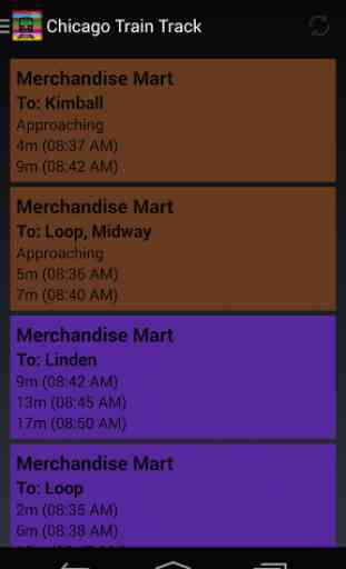
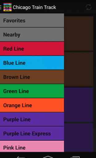
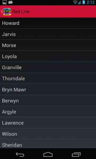
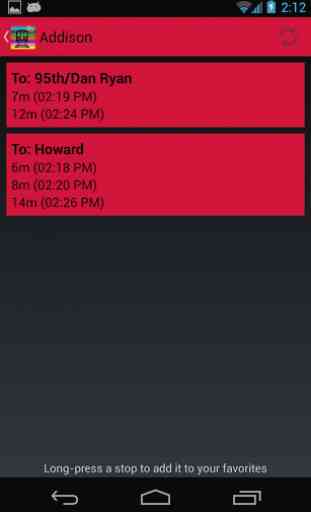
With Chicago Train Track, you can quickly and easily look up train stations and when the next trains are arriving there. Fully supports every stop on the Red Line, Blue Line, Brown Line, Green Line, Orange Line, Purple Line (and Express), Pink Line, and Yellow Line. That's all the lines!
Add a stop to your favorites, so you can see when the next train is getting there right on the app's home screen. At-a-glance info gives you maximum convenience. You can have as many favorites as you want.
This app is not affiliated with the CTA in any way. The CTA provides the data via its Train Tracker API.
Category : Maps & Navigation
Reviews (10)
In need of an update. Randolph/Wabash doesn't exist anymore and has been replaced by Washington/Wabash. Would also like to see a map of the system rather than having to go on line to see the transfer options.
Would be nice to see an option to change font color to white. Black text on brown background is almost impossible to read outside.
Showing the closest stops with their times right at launch is a great time saver.
What about the ability to order the favorites so I can put my new favorite Favorite(s) near the top... or wherever I want? Agree with John Wood, opening to [Nearby] is a good idea.
Could only improve by integrating with Android Wear
Regular commuter, seems accurate, love it! Gives me idea when to run or not to station. :-)
When it louds..bits never ever wrong.. for me at anways
I m glad that I found this app. It looks the same way as original CTA site. And its very easy to use. Thanks guys.
Works quickly and accurately, and it looks good, too.
Well made app. It has what I need to commute. It would pretty cool if you also added the bus times. I don't like using two apps for two forms of transportation I use frequently. Adding a map of the whole train system would be cool. Also I think adding the ability to change the background color to white. You can still use black as background but call it Night Mode. I think it would be useful to add the ability to have font size. Where if the user has problem seen the letters on the screen they could just enlarge the font or vice versa. Most of these suggestions are cosmetic ideas to make the app more attractive. But nonetheless thanks for making such a good and simple tool.