Coalfield CM13 Theme
- this is unique. Dark variant also included thanks to Arcus support.
Download the free Arcus app to choose a theme variant!→ https://goo.gl/b1o0G0
You need a ROM with the latest CM theme engine in order to install and use this theme! ROM support for DU (DU Certified), CM12, CM12.1, CM13, CyanogenOS, AICP, RR, AOSiP, Bliss Pop, Carbon, Euphoria and more. Please report missing Icons so they can be added to the theme.
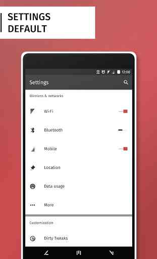
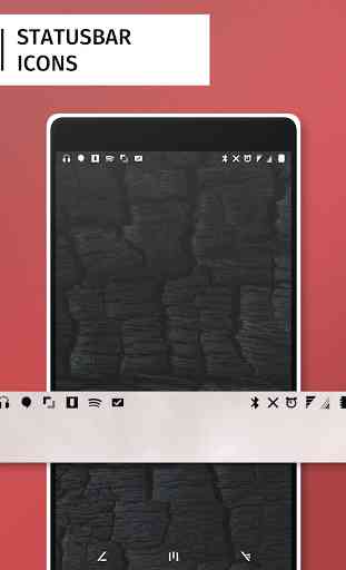
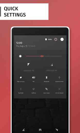
Theme includes:◦ 90+ themed apps◦ Dark style and light style (Arcus)◦ Multiple color variants (Arcus)◦ Bootanimation◦ Vector statusbar icons◦ Themed battery icons (latest CM13)◦ Fully themed quicksettings◦ Animated switches, checkboxes and buttons◦ Volume panel◦ Notification icons◦ Custom font◦ Custom notification sounds◦ Wallpapers
Themed apps:◦ Screener◦ Google+◦ Hangouts◦ Play Music◦ Google Now◦ Dialer◦ Instagram◦ Settings◦ Camera◦ Keyboard (AOSP & Google)... and more! (90+)
Arcus variant colors:◦ Dark style◦ AMOLED black◦ Dirty Unicorn colors◦ Radius colors◦ Yellow◦ Red◦ Green ◦ Blue... and more!
Please review and share this theme if you like it! Thanks for the support! :)
_ _ _You can send an email to [email protected] bug reports, issues and suggestions.
Follow us on G+ and get news about updates and development!→ https://plus.google.com/118223643255196250108/posts
Become an insider, join the G+ Community today!→ https://plus.google.com/communities/111295036831359105836
Category : Personalization
Reviews (28)
Interface color did changed but the pressing color still in red(original) color, not completely changes.
A and of course our Cyanogen mod team thanks for all of it . where can I donate a fat stack of American currency? Towards more AICP DEVELOPMENT?
Yay they ported it to substratum!
I refunded this theme the first time because it didn't fit the style I wanted on my phone. Now I found it again and I'm really happy about this since it's one of the best themes out there. I especially love the detailed animations and the Arcus options are a huge plus too.
it looks absolutely stunning, everything is themed and done in so much detail, and the arcus flavors make it even more awesome. I'm stunned atm by the dirty unicorns variant, just gorgeous. I can't find my words, I think it's art, really. THANK YOU SO MUCH!! 6/5
Love the look and all the Arcus variants (currently using Dirty Unicorns to match my ROM on a Nexus 6). Keep up the great work!
Keyboard is too much red. I can't see space bar. I don't know if you did this on purpose but for me it's not best. Also the keyboard swype line color is almost invisible because it's also red. Thanks
This is a piece of art. Congrats!! 5*
I don't usually buy themes. but you made me. please don't stop supporting this theme even in the upcoming cm14 please. thank you so much!
The status bar battery icon does not change when I apply the theme...I am on CM13
Best theme hands down. Only thing it's missing is custom splash screens for the Google apps like your Radius theme. If you added splash screens this theme would be above any other. Since my phone tends to reload apps often I have to look at the ugly stock Google splash screens all the time and it drives me nuts. So much so that I have to go back to Radius. Other than that 10/10! 👍
Easily the most broad theme developer on the play store, having a large spectrum of apps themed and more coming every update. Keep up the good work.
Hey, just bought your theme, it looks great. I just wonder if it is possible in Dark style to reverse the notification colors? So White text on black background.
But dark notification panel would make it more beautiful
One of the most detailed themes on the market. Superb. Exquisite. Magnificent. Awesome. Synonyms. Lots of synonyms. The best synonyms
I'm stuck with this theme's boot animation. Can't change it on demand...
Best CM theme ever!
But how do you change the color?
Thx for update
A amazing theme for my phone, really enjoy using it. The only issue I have had was a discoloration problem in Google Play Music's download view. A few days after I submitted the issue, I received an update that fixed it. Looking forward to using this theme, and others going down the line.
Can't see the font in Google play. EDIT: could you Please change the color of the font in Google play. It's quite irritating.
This theme really does change your icons, indicators, panels, etc, in a very harmonic way. I do recommend! I also recently noted that this is actually faster than other themes both free and paid I have installed so far!
My phone has been blessed. BUT can you please theme the email app? It looks like its never been touched.
One of the best themes :)
This was my go-to theme for a long time. Unfortunately recent updates changed a lot about this theme that I didn't end up liking. Facebook alerts (unread) were changed to entirely bright red with medium red text, whereas read alerts were just plain white. Notification text is now bolded in caps. Finally the font itself appears to have changed as well. Switched to a different one, and at this point I'm using no part of Coalfield. Oh well.
And always in movement - the developer comes up with new ideas & designs all the time 😎
Simply one of the best premium themes out there!
Bought it mostly to support the devs who do a great work. This one's great too but in doubt Outray is a bit more polished and shiny (especially when it comes to status bar symbols).