Color Clock
Color Clock is a beautiful multipurpose analog clock that can be read at a glance. No fancy features, teeny-tiny footprint and zero permissions required. It can be used in every possible way.
★ As a regular app
★ As a widget on your lock screen*
★ As a home screen widget
★ In a desktop docking station*
★ As a car dock app
★ As live wallpaper
★ Should make for a great wristwatch widget.
* Highly recommended
Color Clock will also be a perfect app for the Google Watch when it comes out.
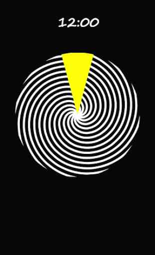
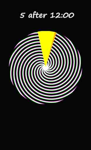
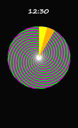
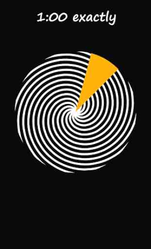
The design is based on the 1971 Chromachron clock by Tian Harlan. It has a background of 12 unmoving uniquely colored pie slices, and a moving "hour hand" consisting of a mask covering the entire background except for one hour's slice. As that gap moves around the dial, you will see one background color slowly disappearing and the next one filling the gap. On the exact hours, you will see only one color filling the entire slice. In this way you can easily estimate the time within 5 minutes. It is particularly useful for users with poor eyesight and can often be easily read without corrective lenses making it perfect for a night-stand clock.
So what about those spirals? That is my attempt to make something pretty to fill in the unused space but still be based on the current time. They are not meant to be useful, but if you are interested in how they relate to the time, it consists of three overlapping sets of spirals in red, green and blue. The red spirals represent the minute hand, green the hour hand, and the blue spirals don't move at all. Where they overlap, the colors add together just like light. The only time that all three sets of spirals exactly overlay each other is on the exact hours. That is the only time you will see pure black & white spirals. The rest of the time they overlap in varying ways to generate yellow, magenta and cyan.
If you watch very closely, you can just barely see the red spirals moving. It takes one minute for them to move from one blue spiral to the next. The motion therefore is very subtle but you will notice that every few seconds the colors that you see are completely different even though you can barely notice any change from moment to moment. Also interesting is that because the red, green, and blue spirals add together just like light, the overall mix of colors never changes. That means that from a distance it always appears white even though close up it is very colorful and ever changing.
★ As a regular app
★ As a widget on your lock screen*
★ As a home screen widget
★ In a desktop docking station*
★ As a car dock app
★ As live wallpaper
★ Should make for a great wristwatch widget.
* Highly recommended
Color Clock will also be a perfect app for the Google Watch when it comes out.
The design is based on the 1971 Chromachron clock by Tian Harlan. It has a background of 12 unmoving uniquely colored pie slices, and a moving "hour hand" consisting of a mask covering the entire background except for one hour's slice. As that gap moves around the dial, you will see one background color slowly disappearing and the next one filling the gap. On the exact hours, you will see only one color filling the entire slice. In this way you can easily estimate the time within 5 minutes. It is particularly useful for users with poor eyesight and can often be easily read without corrective lenses making it perfect for a night-stand clock.
So what about those spirals? That is my attempt to make something pretty to fill in the unused space but still be based on the current time. They are not meant to be useful, but if you are interested in how they relate to the time, it consists of three overlapping sets of spirals in red, green and blue. The red spirals represent the minute hand, green the hour hand, and the blue spirals don't move at all. Where they overlap, the colors add together just like light. The only time that all three sets of spirals exactly overlay each other is on the exact hours. That is the only time you will see pure black & white spirals. The rest of the time they overlap in varying ways to generate yellow, magenta and cyan.
If you watch very closely, you can just barely see the red spirals moving. It takes one minute for them to move from one blue spiral to the next. The motion therefore is very subtle but you will notice that every few seconds the colors that you see are completely different even though you can barely notice any change from moment to moment. Also interesting is that because the red, green, and blue spirals add together just like light, the overall mix of colors never changes. That means that from a distance it always appears white even though close up it is very colorful and ever changing.
Category : Personalization
Related searches
Reviews (3)
Cos. D.
Jul 1, 2018
I was expecting the original chromachron. What's with the crazy swirls - they are terrible on the eye! And you should have stuck to the original colour circle. Red is 3 o'clock, never 9! Please go back to the original based on Tian Harlan's design! That was 5 star!
A. G. u.
Oct 2, 2015
Too cryptic for practical use.
Could use a standard digital clock format above the clock in the app.