electricityMap
Category : Maps & Navigation
Reviews (30)
The app works well and looks really cool. If anything I'm just jealous that most of the US (including the part I live in) is kind of messy boudnrt wise and has no live data. I understand this is likely a result of the utility company, not the developer, but you still have all this really cool data, shame it's not displayed on the map just because it's delayed.
I really like the service. Two improvements I would like to see would be able to create a widget for a certain country, so you can always see what the current CO2 emissions are. And it would be awesome to set an alarm. Once the émission go below a certain threshold, you would get a notification and can turn on more energy intensive things (washing maschine/fill pond/...)
Installed 2022 version and now works...nearly - lots of data, but "live data is temporarily unavailable" for everywhere I have tried.
Excellent, accurate data which updates every 15 minutes! I don't recall the app ever crashing. The only downside is that less than half of worldwide grids are present. But because Electricity Map is open source, that can be remedied by a few data tech persons. Sadly that's not me.
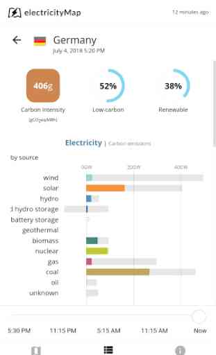
The site is a great on a PC browser and OK on a phone browser, but the app has several issues, not least of which is the fact that some major countries, such as Germany, are permanently missing, despite being fine on a browser.
Very handy app in progress, functionally. Needs more data progress and some gui improvement on selection in the tables of energy sources. 1 large fault, the map is not displaying colors and low visual borders (solar/wind the same) . On my android 7.0 phone 1080p phone. But good on my 7.1 phone 720p
App won't show any data but when you go onto the Web site direct it works great
Live data doesn't work so don't see the point of it.
Thanks for getting the UK interconnectors back online. Plus the insertion of the North Sea Link (NSL) ready for 2021. 16/1/2021 - Please note, that the UK has been missing "electricity prices for the last 24 hours" for the last week. Thanks
Really a helpful and interesting app. I'd like to have the ASEAN countries added. Any plan for that?
Very cool way to visualize something that is hard to visualize for most people.
Great app but for some reason the wind and solar production and consumption don't show up when they are on. Is this a minor and temporary issue?
Wow! Good info, presented in an easy to understand format. Kudos!
Great app. Really interesting insight into generation and demand around the world.
A great app to check actual CO2 emisions of electricity production for different countries. Well done!
Awesome app, sadly where I live the data sources are too depressing and coaly.
Nice app, but the website works almost as well in a phone. So not really necessary
I use the app since years and is improving day by day. These guys are amazing!
Brilliant app. Helped me to understand what is going on daily on the electricity market and strengthen my opinion of superiority of nuclear energy.
Fantastic visualization of electricity production mix and cross border trade in Europe. Other parts of the world being added gradually.
Request the developers to add more regions and more details inside regions. Please advertise that this an open source project so that interested energy enthusiasts can join
Good idea, but lots of bugs
GREAT!! Shows NUCLEAR POWERED GRIDS BEST!! GERMany=LOVES COAL AND EMISSIONS!
Amazing concept, but are you sure about the 230 g/KWh specific eq. CO2 emission of Biomass? Looks way to high to me.
This is a good map for showing people that America is not the problem in climate warmth.
Very cool and informative!
Brilliant app that brings some sense to the debate on climate change solutions...nuclear and hydro countries shown to be lowest carbon large economies.
Great app. Only criticism is that it says "Tomorrow" in the corner. It's the name of the developer, but it's confusing if you don't know that - implies that the data is a prediction for tomorrow!
Last update started to use a lot of traffic and storage space, almost 300MB in user data. Deleted it, reinstall and user data is at 120MB
Great resource. One problem, after selecting a country, pressing back has no effect, I am stuck on that country and can't return to map. The only solution is to quit the app or select another country in the "Areas" list. Very interesting to see changes as winds and sunshine vary. An easy to use educative tool for the general population on how clean (or not) our electricity production is.