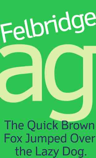
Felbridge FlipFont
Felbridge™ Latin FlipFontSpecial characters like the ‘l’ and ‘i’ make the Felbridge™ font very legible. It’s a new sans serif designed for the digital age.
Now supports Russian and Ukrainian.
Pan-European character setsupports Western, Central and Eastern European languages.
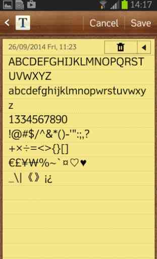
Attention! Please check the following before you purchase.Go to Setting->Display, check if you see "Font syle" in the menu (FF icon in the font list).If not, that mean your device does not support FlipFont.
Supported devices: Samsung Galaxy devices, except the Google Play Edition.
Category : Personalization
Reviews (30)
I have purchased every Latin font here, most are great, but this is rodentware. (1) Instead of offering renewable licenses, your purchase info disappears every few months and u have to keep repurchasing (2) I call this rodentware because the pckgs carry diseases. Never download fonts large than 60K, never back them up locally, and scan at least once a week. If you're rooted, don't even use these. Check the permissions - they change - never put fonts on a whitelist, never set up auto or push upgrades. xxoo
I don't feel the font change. Looks like the phone original font. Plus, there is no refund.
Might look like a cross between a serif and sans to begin with, but enhances readability significantly. Worth it.
I've been looking for the best font for mobiles. I have scoured the app store and internet and have determined, without a doubt, that this is the absolute BEST font for mobile. Clean and simple, yet has character. Very readable. Also like the fact that you can tell the difference between I and l
The biggest improvement over the default stock font is that you can tell the difference between capital I and lowercase l.
Best Flipfont font available IMO. Been using it for quite a while (2 years-ish?) Love that I & l are easily distinguishable.
Very readable, useful everywhere.
Very easy to quickly read text on phone screens. A pleasure to use.
i always want a very simple and clean font. this answers my need.
My favorite font for the S7 Edge. Crisp & clean.
Clrearly Readable. Love it
Highly Readable
As others have noted, no spacing problems. Good stock replacement. The lowercase letters are quite small, making the display compact but a little less readable. Matter of personal preference whether you like that.
Sized perfectly - all spacing is perfect. Lots of character with being distracting.
This font looks great, even on my pentile Galaxy S III. No spacing issues, the font is very readable and pleasing.
Only thing I'd like to see is a strike-through (null) 0, to better differentiate from O at a glance. Otherwise, great typeface!
Has just enough character to keep from getting boring. Perfect for a phone interface.
Looks and works excellently on my Galaxy Nexus phone. Thanks.
Best font so far for Samsung Infuse. Larger than most which is better for us older folks.
Looks nice, but sits way too high, goes out of frame in many apps and widgets.
Very clean, looks superb on Galaxy S. Slimmer than the default font and a little smaller
Perfect font for the Galaxy line of phones with all their Super AMOLED beauty (Vibrant)
Very nice font looks a lot cleaner, galaxy s, froyo
Very easy on the eyes with just enough personality. This is my permanent default replacement on my Captivate.
The kerning just didn't look right with smaller text (such as in Gmail). Bummer. (Samsung Vibrant)
Doesn't work on my fascinate, or I'm just to lame 2 figure it out, or maybe my phone is 2 blame? Whatever its not the fault of the dev.
I love this font. So much better than the default bolder and bigger......samsung captivate
Looks beautiful, and super easy to read, on my Galaxy Tab
Gorgeous font for Samsung Galaxy S. Love it!
So many of these FlipFonts available on the Play Store are just not suitable for systemwide use. I don't want my expensive phone to look like it was designed for a child. I am still searching for a clean light font. In the meantime this one isn't too bad but still a bit heavy for my liking,