Kuvera Direct Mutual Fund App
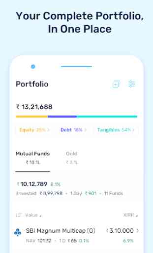
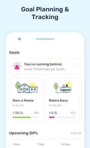
Our goal is to build India’s largest investment community – a safe haven for investors to learn and grow their wealth. To get you started we help in comprehensive goal planning, tax savings, smart rebalancing, funds selection, and return analytics – everything you would expect from an advanced investment management platform.
As an Registered Investment Advisor (RIA) with SEBI, we only allow Direct Plans of Mutual Funds on our platform.
In short, our DNA is aligned towards making investing easy to help you reach your financial goals.
Category : Finance

Reviews (24)
The design / UX team seem to have forgotten that sometimes simplicity is the ultimate sophistication. In the bid to add more information, the user experience is ruined. Too many clicks to see any info that I want now. My complain with Kuvera restricting the holdings to showing only top 10 stocks still remain as is. Revised to 3* for the follow up call. Will revisit later. Additional issue : can't scroll back to the page while navigating. Takes me to the screen to enter pin.
Just like all other users have already pointed out, simple UI has been messed up with a new design... New UI is not smooth enough, takes multiple clicks, doesn't have required features, etc..and page load on every clicks is just irritating! Why??? You definitely need a better performance testing done with new UI
The home and portfolio pages show different returns. Please sync them!!!! Also, no. of clicks to view transaction, goal allocation and other details of our investments has increased as we have to go back after seeing each detail, then go to the new detail by clicking. The tabs were much better. No. of filters and sort options has reduced considerably and is not very favourable for the users.
Great App. It has everything that you need to invest in mutual funds in one place Edit: The recent UI changes have made the app more cumbersome and difficult to use. I use to like the earlier interface where it was simple and if anyone wanted to get more information they could drill down.
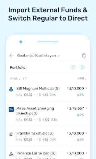
Team Kuvera, your recent updates have made the app more complicated and difficult to understand. For example - when I click 'portfolio' tab, it shows various numbers and % against each fund, without telling what those numbers mean. Pls revert to the earlier interface, it was much better, simpler and easy to understand.
The latest update has made it super difficult to navigate through the app. It's very difficult to find out things now. I loved Kuvera because of the interface that you had. The new interface is not helping. It stops me from recommending it to other. Pls roll back to the older view. This new design just doesn't work
Have been using Kuvera from past 3 years and was happy as it served the purpose. But with recent updates Iam not able to see how much P/L for each MF per day. The UI just shows overall P/L percentage wise which does not help. The UI looks better but does not serve the functionality. Not sure how it passed the User Acceptance Test before release! :(
Nothing against kuvera ,this used to be one of the best app cause it was simple and not anything gimmicky, but looking at recent updates it is a perfect example of how not to mess a simple UI, please give an option to use older UI till the time you guys fix the new UI, it is so messy and cluttered that i seriously don't want to use it and am planning to move to another app. Edit: Adding one more point which i have started noticing recently that customer support is getting worse every day.
Like most users, I totally dislike the new UI. Please revert to the old UI. The new one is very confusing, specially on the Portfolio tab. You can't see daily equity and debt fund p&l. The percentage returns are very confusing. It's a complete mess unfortunately.
The UI is so bad now after recent update. They also removed the feature where I could filter investments as per goals. If I can't filter using goals, then what's the point of putting up my goals and goal tagging in the first place.
I have disconnected my zerodha account, MFs, from this but it still shows in the portfolio. The app seems to store the data with it. This is risky as the details could be leaked in future due to any security breach. Besides the UI is weird and app is very difficult to handle. It was a big mistake using this.
The latest update is very bad. On portfolio tab, I can't see my total sum of equity investment anywhere. It only shows total investment. If I click equity as filter, total just disappear. Veey annoying. I wonder what were you trying to solve with new UI, and i just made everything difficult.
The search feature is absolute trash. If you don't know the name of the fund you're looking for you're out of luck. For e.g. I wanted to search for Navi's US funds. I type in Navi and it only shows 5 results in Mutual Funds, none of which are the ones I'm looking for. You can filter by AMC in your MF portfolio but for some reason that is not an option to filter on when looking at "All Funds". This app is excessively dumbed down and needs serious improvements.
The new UI is not user friendly. The user experience is worsen with the current update. Font size, layout, Sorting, filters etc.. most of the elements are not useful, please revert back to old version.
The old application interface just required some refresh look with new color themes,but new change over is NOT a welcome change.Sometime simplicity works well instead of making things more complicated. 2ndly the application only shows only top 10 mutual fund stock holdings,please incorporate so that we can see all stock holdings in a mutual funds.
The new UI in very bad. It looks like it is created by child that are leaning UI design. Previous UI was good. It is showing less information in new UI. If you cannot improve UI then please reverts to previous one. Please don't experiment the UI with dull look.
Along with market volatility, app's complexity is also increasing proportionately, New UI is super complex even for digital natives. Some experiments are better to be reversed quickly before it mess up the good part of product.
Team Kuvera, your recent updates have made the app more complicated and difficult to understand. For example - when I click 'portfolio' tab, it shows various numbers and % against each fund, without telling what those numbers mean. Pls revert to the earlier interface, it was much better, simpler and
I am using this app for quite a time now. It was easy to use. Team Kuvera, please bring back the previous interface. It was simple and easy to navigate. The recent update has ruined the UX for me.
UI experience needs to be improved. I liked the previous UI it was simple but easy to access and navigate. Ratings are revised after follow up call.
Make the UI - light, simple and easy to use. Need to simplify the whole UI. The old UI was simple and neat. Kindly rectify it soon.
Stocks are shown in %, How I supposed to check the no. Of stocks. The old version was better. In Your app preview pick, you are showing no. Of units, but it is missing in app.
Thank you for your call and understanding the challenge. Yours is a good platform added 3 more stars In new version, you just made it very complicated!!! Can't see what is % return for every fund!!


Dear Kuvera Team , I would suggest to keep the UI as simple as possible just like the earlier versions of the app. I have been using this app for more than a year now. Initially the experience was superb, but few recent patches have made it a bit difficult. To make the UI more informative and statistical, you have actually put a lot of content together which is kind of difficult for many users. Sometimes keeping it simple is the best way to go .