Lao font for Samsung Galaxy
Category : Tools
Reviews (29)
For everyone giving negative feedback clearly says for Galaxy S phones extremely simple download apply the font in settings this is the prettiest one I've found makes me feel frustrated for the devs when people download their apps without reading and affect a great app with a negative score!!! Great job Dev!!! :))))) Galaxy SIII
Cannot work on Samsung galaxy s3 at the moment (before it worked) ... plss fix it
Please update version for android jellybean 4.1 Be cause it not perfect working in 4.1
Didnt wotk for galaxy s4 please update
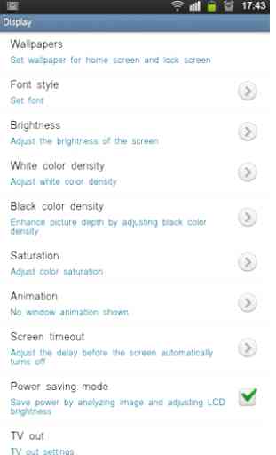
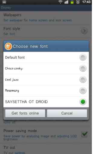
To people having probs.Go to settings,display,screen display then font.Also i wish people would understand what they read it's for the Samsung Galaxy.The dev makes it quite clear.
What is it with threse fonts! There allways thin and small, give us a BIG BOLD ONE
I can't download. It says.insufficient atorade available
Pls help!!! I've downloaded almost every lao font but it says"this font is not available" .. can anyone suggest me how can i view lao on my galaxy s4..thanks
Unable to read lao in facebook or browser and some app. Message working problaby.
its not too attractive bekaar hai
Very Poor. No option how to use.
it only gives me one font that looks like arial font of windows.
Just what i was looking for my note.
Love it
Stupid! Cant oppen
Y my phone can't use it..
doesnot waste my time
I have an s3 did just what the instructions said and no fonts found?.
Dont bother
Not bad at all...
Can anyone tell me how can I apply????
Loved it
Os informs me it's not compatible, and leads me right to uninstalling. Oh well.
DON'T INSTALL IF THE NAME OF UR PHONE DOESN'T HAVE THE WORD GALAXY IN IT! AWESOME I LOVE IT
Its a simple, beautiful font that makes it easier to read text without having to increase text size. Only reason I gave it four stars was because I was hoping there would be more than one font to choose from.
Wow! Love it worked like a charm. Need more choice! Other apps require to much. This app just loaded and set! Awesome!
Can't even find this stuff on my android! This thing is bullshit man!
Looks weird and uneven in table if contents. Plus the spaces are too big..... Yes its free, I know, but you're better off with the default font.
Am still wondering how you manage to keep it free. Please keep it up and free. Love you guys.