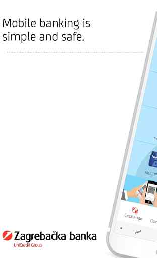
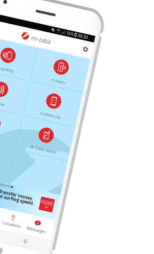
NOVA m-zaba
• find information about cards, check PIN and manage its daily limits
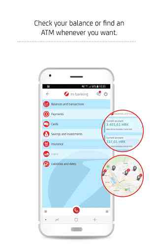
• check the balance and transactions of accounts, saving accounts and loans
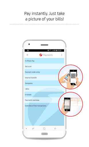
• pay your bills by scanning them using the m-photo pay or the fast scan service
• easily transfer money using Izipay. Receiver's phone number is all you need.
• trade in the shares of ZB Invest funds
• trade on global stock exchanges via ZB Trader Global service
M-banking and m-token services can be contracted via e-zaba or at any of our branches. Other services, such as the ATM locator and exchange rates, are available to everybody, without the need of contracting them at the Bank.
SAFETY
Zagrebačka Banka pays special attention to the security of operations performed by mobile banking clients. PIN used to access the services is only known by the user and therefore there is no threat of abuse if a mobile device is stolen or lost. PIN and account information are not stored in the mobile device, and the entry of PIN is protected by a variable keypad. The services that are accessed by entering PIN are automatically blocked if an incorrect PIN is repeatedly entered. After a 3-minute period of inactivity, m-zaba automatically logs out the user.
Category : Finance
Reviews (27)
Waited for the new app to maybe fix the issue I had with the old app where on my Android 11 OnePlus Nord the app would stop working a day or two after reactivation. I transferred the keys from an old phone where the old app worked and after a day the new app stopped working on my new phone. The Developers should test their apps on more than 2 phones.
After the latest update most workflows don't work as intended. Very frustrating to use. Edit1: I just tried to scan and pay 3 receipts. 2 were succesfull, and the app crashed and I can't log in anymore.
Quite bad UX and a number of bugs. It looks like somebody draw a few nice pictures and then force-squeezed functionality inside. Dear ZABA, you don't have to show the information about your new credit line every single time I login, it is very irritating. This app is either untested or it was tested by somebody without any experience.
Previous version was much better and easier to use. This version is not organized well, has useless charts that take most of the screen, navigation is not intuitive and it takes time to find optionts that I need.
The app works very well. However, the new UI is less intuitive than a previous version. (4/5)
Upgrade = Downgrade New user interface is terrible. The screen is mainly used for giant unnecessary pictures and graphs, endless scrolling is necessary to do or to see anything. The only thing worse than user interface of this app are generic PR comments from the publisher.
BRING BACK THE OLDER VERSION!!! It had such a better user experience than this updated version!! Like how can you think that an improvement of an app is to make it HARDER TO NAVIGATE!!! And also why those USELESS GRAPHS?! WHO WANTS TO WATCH THEIR GRAPH GO DOWN LIKE REMOVE THAT!! How do you expect older people or people with disabilities to navigate this kind of app! It is totalln not user friendly at all!!!!! BRING BACK THE OLD VERSION!
Downgrade from the old version in every way; everything requires twice the amount of clicks/swipes, UI is harder to understand , and the font is hard to read...
Font is way too small, irrelevant features have priority in UI, navigation is confusing and I need more clicks to find what I want, last UI was better, one of the worst upgrades ever.
Since your app is not working at all atm I'll take my time to leave a review. The redesign is horrible. It's way more complicated to navigate. The fonts are super tiny in some parts of the app. In other parts the text is huge and spaced apart so much it feels like you're intentionally wasting space and making me scroll.
To improve ux of the app, it would be nice to have each row with different shade interchangeably, white and light grey. It improves readability.
Unintuitive badly made and bug riddled version of the app. When the majority of your users are asking you to rollback to the old version you might want to rethink your current development direction.
Modern look, but unfortunately it compromises on the important information. Why not give us the option to have a clean overview of all accounts (like in the previous versions), and when chosing a specific one, open a new page with the flashy graphs and whatnot? Maybe also put the option to disable the graphs as they take screen space but are not a vital information. Swiping 5x to see my balance across the accounts is not very intuitive, but instead tedious. Just give us the option to customize.
The previous app had all the funcionality needed. The new one takes more clicks to do things, the font is more difficult to read, and stuff was reorganized so you have to spend more time to search for it. But hey, we got a few cool pictures so I guess that makes it worth it? It's still functional though, so a star for that.
The old version was easier to navigate and better organized. Some of the useful filters have been removed (payments, withdrawals..)
Like someone else already wrote, I am seriously considering changing the bank just because this new version of the app is not user friendly at all. Graphs should be optional and subject to customising, fonts are way too small, requires a lot of scrolling/swiping, clicking - old version used to show all options on one screen... I can't find "Obavijest o troškovima" related to my credit card... Where are the colours gone so that we can easily differentiate between inflow and outflow of money?
Too small font makes app productivity very degraded. There is several months since release and still no fix for this. Looking at comments, alot of people complaining about this, but still nothing from ZABA. That is not too good apriach to customers.
Nice looking, functional, responsive.
This app is not very intuitive for average user. Past version was easier to use.
Worst update ever, design team responsible for this failure should get fired asap, return the old version or redesign the redesigned version again, this looks and feels like a 4 year old did it.. better not to comment the account balance clearly visible to everyone around when you start the app..omg, you would think a BANK knows the importance of private information and security, but obviously not in the case of this bank..this is by far the worst update since the start of this app
I thought that after new and "better" revamp the app couldn't get any worse. Well I was wrong... Now I can't even log in, it crashes every single time... Too bad there isn't zero stars...
The old version was easier to navigate and everything was well organized. The font size is smaller now for no good reason.
Had to change the rating due to a new update. Absolutely awful and almost useless, many options went away like the loan installment details. Edit: Credit installment details ili detalji o ratama kredita.
This rating is only for the new design. It seems functionality was sacrificed in favour of "pretty" layout. Old version had everything needed, it was simple to use and intuitive. Now it takes longer to navigate through the app and some functionalities are missing.
Trash, complicated, too much clicks, they should downgrade to previous version of aplication. Thinking about canceling this feature
The new version is bad. It takes me more clicks to do everyday tasks compared with the previous version. I don't think it was designed for people that use more than one account. Big fonts and graphs looks pretty but make it impossible to use the app in public without over sharing with everyone in a 10m radius.
The new design makes navigating extremely confusing and frustrating. Functions aren't in the same place so you have to waste time trying to find them. The former layout was much more practical and navigating was easier. Also, when you unlock the app you can see the balance right away (with the useless graph) which compromises privacy.