Ryerson mobile
Ryerson mobile is a suite of mobile applications that make campus living at Ryerson University easier and more enjoyable. These services are available on or off campus on any WiFi enabled device or web-enabled smart phones. Wherever you are connected, you will have access to an ever-growing range of mobile services.
Category : Education
Reviews (23)
This app needs to stay logged in! It is so annoying to have to log in every time I want to access anything on the app. Also the UI is junk, it lags and is slow. It looks ugly and unprofessional. What does that have to say about Ryersons computer engineering and computer science courses?
Tragic and ugly, need I say more?
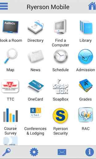
Quick access to commonly used services. However the scroll is funky. E.g. book a room page, scrolling down sometimes does the reverse. Therefore going through a long list of rooms available is extremely frustrating. UI needs a lot of improvement. Placing Home button at the top right is just not convenient. The hamburger menu is redundant mirroring exactly what is shown on the main page.
Can y'all update the design of the app now lmfaoo?? App looking like Windows 98 over here...🤚🏾
It's practical and does what it needs to do. Very helpful.
The UI needs adjustment, but this is better than having to go to RAMSS
Could be prettier but it's in beta so i get it
Does everything it's supposed to do.
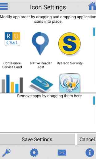
I kind of like the app icons even though they're oversized. Horrible side button design, inc. the sidebar section in Map. Slow performance.
The map UI looks like it was make by a high school student.
It crashes when ever I try to do anything.
Barely navigable, awful design, and very slow. In order for this app to deserve even 3 stars it needs to meet Android's design standards.
Its ugly to look at. You're making a mobile app for a university that is the haven for innovation yet cannot make a decent looking modern app. Update the brand, the design, and the functionality, soon please.
Ugliest app I have ever used, not to mention it doesn't even function... You'd think they would read some android design guidelines before making a 2nd android app but I guess not
Yeah. The icons are finally fixed but it breaks the Android design standards quite a bit. And there's weird fade transitions everywhere detaching from the snappiness of the app. Another issue I noticed was that typing and scrolling within the login were very laggy and choppy. The in app browser still uses the gingerbread API
Much better then the previous app, however it still needs a better UI!!
For what it is it seems to work well enough. I only installed today so I haven't encountered any bugs or crashes yet.
All u are doing is adding webviews just like the old app..there is no difference...make a compeltely native app that is visually appealing
RAMSS access would be nice. Access to Ryerson Email/Gmail would be nice, too. Accessing courses would be good, too, without using the blackboard app.
Lets start by improving the app icon and making it proper resolution. It looks ugly. It doesnt look anything like a good 2014 application
ryerson has computer scientists and comp engineers... update this garbage pls
Eradicate the terrible theme and icons and you'll be guaranteed better reviews.
there's really no point in downloading this app. Its just a less user friendly version or ramms which already hardly works and seems like it was made in 1996. you also have to type in your password every time regardless of whether or not you click "remain logged in"