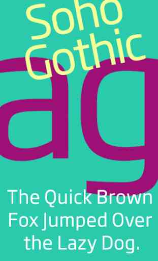
Soho Gothic FlipFont
Soho® Gothic Latin FlipFontThe Soho® Gothic font is understated, very readable and will give a sleek, contemporary look to your phone. This is the dry martini of fonts.
Pan-European character setsupports Western, Central and Eastern European languages.
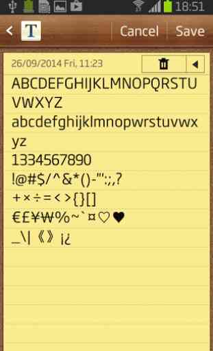
Attention! Please check the following before you purchase.Go to Setting->Display, check if you see "Font syle" in the menu (FF icon in the font list).If not, that mean your device does not support FlipFont.
Supported devices: Samsung Galaxy devices, except the Google Play Edition.
Category : Personalization
Reviews (25)
Font is perfect on the standard S7 in Condensed mode.
Love this font
Lovely fonts
Bought it tried it, not at all readable. same size as default on Galaxy S. need to be able to change font size.
Love the font but the spacing needs to be fixed, lines over lap on top of each other in apps such as Tajm and Battstat.
Very nice, futuresc looking font, HOWEVER letters cut off at top in texting, numbers and accu weather widget on GS2! Please fix this beautiful font :(
This is very obviously a beautiful font, and a great change from Samsung Sans... but just like in other reviews, there's some places where the baseline is just too high. Perfect on app names, yes. But the S4 default clock widget, among other widgets and apps? Nope. Cut off and is intolerable. I'll keep hoping for an update... but right now I'm feeling ripped off.
Great large size front for those of us who need it for reading. Will cause slight alignment issues in some apps because of its size. Very minor thou
I'll give it 5 stars if its corrected...
Great font but sits too high causing misalignment specially visible on apps that use smaller font sizes. Not acceptable for a paid font. Everybody has complained. Please fix this and I''ll give it five stars.
This font is great but the letters are aligned too high. It causes problems in some apps, please fix. Will change to 5 stars.
The alignment is way off (too high). things like this make a font unprofessional and therefore I have to refund it though I like everything else about it :/
Font is great but space from line to line are narrow update the font and make the line more space.
Great font, clear and readable, but not quite what I was looking for.
Funny how a font can make such a difference. My phone is now 220% cooler than before thanks to this font.
Another great font. I switch between this and Frutiger.
Font sits high on samsung vibrant
Looks great on samsung capivate!
Love this fontface.
When will this app update?
While this font looks very aesthetically pleasing to me. It seems to cut off the top of the letters in some programs. Not sure if it's my device or the font. But, other people seem to say it works well, so it must be something wrong with my device.
This font is modern, clean and well tuned. Great for reading a text message or a few chapters of a book.
would like regular, medium, light, condensed, etc. to replace the default font on my phone, and still see light subheaders
Font cuts off letter at the top.
Opened and 1st look was NO!