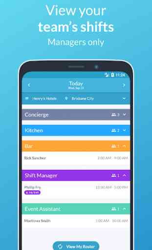
Tanda - Employee App
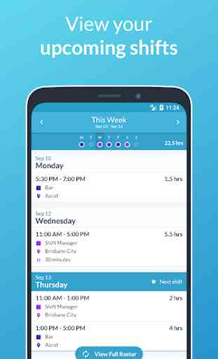
* View your upcoming shifts
* View the status of your leave requests
* View your timesheets
* Apply for leave if your workplace has it enabled
* Manage your unavailability if your workplace has it enabled
* Request a replacement for your shift if your workplace has it enabled
We're always working to make Tanda better. Expect to see improvements and new features appear regularly! You can send us feature ideas and feedback through the app.
About Tanda
Tanda is the world's #1 platform for workforce success. We build cloud software for scheduling staff, managing attendance, and making business decisions. Our vision is to build a product that allows businesses to build truly productive workforces, so they can ultimately grow their business and create more jobs - we're doing this by helping staff be happier and more productive.
Run a business and want to make the most of your workforce? Sign up at my.tanda.co/try
Category : Business
Reviews (30)
This new version is a useless disgrace. The "old" version showed everything I, as a Manager, needed to see. Now it's a hot mess of skip, scroll, tap, skip, scroll, tap etc etc until the end of time. Why change something that was easy to read & worked?? If it ain't broke don't "fix" it. Get rid of the "pretty" and return it to the previous version which was practical on both Android & iPhone. How about spending the developer's time to focus repairing basic stuff before we focus on the pretty?
The updated UI is very unattractive, especially for users who are used to the old UI. It's difficult to navigate and everything is overwhelming, everything is big, including the fonts. I was satisfied with the old UI as everything was in a one-touch distance, and everything fit on my screen at once. Also some of the buttons don't even function; the red feedback button on the right hand side, the "copy calendar link" button says it's copied, but had no effect.(Android 11/12) Switch UI button pls
I dislike this new update and hope it is improved but formatted to work as the old version did. I liked the fact before that I could see all my shifts displayed on one screen. Now it's slow changing screens to see each shift and when you get to the screen, scrolling through is a waste of time. The whole layout is hard to follow.
I've used this app for about half a year now. I just got a different phone, Samsung Galaxy S7, but it doesn't seem to work on this device. Everytime I try to log in, it crashes. I've tried numerous things such as re-installing the app, clearing data & cache, restarting my phone ect. Nothing seems to work tho. This is probably just a device issue, but I thought I'd let you know, also for all the other Galaxy S7 users out there
This app was fine and perfect before, but this new update has ruined it all. In their attempt to make the app more modern and "updated", Tanda sacrifices ease of use and information density. My shifts used to be displayed in a compact manner in weeks, but now each is composed of an unnecessarily large box, and displayed in fortnights, so I have to waste time scrolling and pinpoint which day I work, which for some reason is in light grey text in the SMALLEST font. I could list way more problems.
Since the new update. Tanda Mobile app have been very slow , doesn't refresh quick enough when you toggle between your shift and TEAM shift and sometimes it displays all the staffs from multiple venues which makes it very difficult to work. Hopefully it's fixed soon.Also , employees would be at work but it keeps messaging you're late for work. Also if we uninstall the app and reinstall it is extremely complicated to log into app .However I couldn't log into my browser but not into my App. Thanks
If I could give a lower rating i would. . . Ever since my work has decided to use this app clocking in and out of work has been a nightmare for everyone I work with. Constant bugs, doesn't always update any new shift changes, won't let you put your unavailable dates in even though its before 2 weeks notice and doesn't always register when you clock on or off. Considering this app was made to make things more efficient, all it does is make a simple task 10 times harder than it needs to be.
Never in my life has an app made me so mad! The update has rendered it utterly useless. I can't track my hours any more which I need for reporting. The hours it does track is way off. It's telling me I worked 4.33 hours last week. Not the 24 I did work. It makes NO sense! I'm now having to try and find a way to manually track everything myself. Which is impossible for me to keep on top of! Please at least give the option for old view on Android. Was 5 stars. Now it's not even worth 1 star!
No, the new (Feb. 2022) update didn't fix anything, it's literally just a GUI face-lift. Overall it's (still) garbage. I can't accurately tell if I'm punched in or out or not. Easily over 90% of the time I can't clock in or out. The most consistent time it does work is if I'm clocked out and start a break; but then it won't clock back in from the break. I'm literally forced to keep a punch log of my actual punch times to due to this app's bugs.
Bring back the old Tanda UI. The new app looks awful, and it's so much harder to find the information you need! You could see everything you needed with a couple of quick glances on the old UI, now everyone at my work worries about missing a shift because they don't even trust themselves to read their roster properly! Awful!
Previous version was easy and functional. New version has lost intuitive layout and simple ease of use such as swipe functionality in rosters. Load times drastically increased. Looks like a graphic designer was given the reigns and ignored all the software developer's input. Would give 0 stars if possible.
Since the last update this app is consistently crashing and is not set out in a logical format. Iron out your major bugs before launching the new platform. Highly annoying when depending on the information on this app in a timely manner. Very slow. Would not recommend.
New layout is terrible - update was forced and is absolutely unuseable. Please bring back the old layout. The new look and way the app works is very unfriendly to employees. Shift notes only displayed when you open the individually shifts and the app crashes often. Don't bother.
Recent update is a massive improvement. The bar at the bottom with quick access to timesheets etc is great. Can see my weekly hours and expected gross pay. Glad the developers worked on this. There are still some issues with lag/pages not loading sometimes. Suggestions: allow timesheets to be downloaded somehow. Add a dark mode.
I used to love the app! It uses to be really easy to use and super quick and now it's a slow stutty mess with so much whitespace I feels like it wasn't designed for mobile at all! I really used to love how simple and quick using the app used to be but whoever designed the latest update is honestly the devil, it's now a nightmare to use and finding all my shifts for a week is tedious, better writing my shifts into a calender and using that instead. Dissapointed if anything.
Used to be so good, new "update" looks pretty but is far more fiddly to navigate. Super annoying when it's something you rely on numerous times a day. Edit, its actually worse, glitchy and slow moving between screens. Contrast shocking in some places-yellow writing, in a lemon text box on a white background! Can't read it! Can't mark a staff members shift "can't work" and offer it to other staff, guess I have to go to the website to do that now. Hopefully they don't mess with that too.
Updated version is a massive downgrade, give us the option to use the old version. Can no longer see breaks. Can no longer see hours per day. Can no longer set starting day of the week. Weekly roster has much slower load time. Can't set what is first shown on the home screen. Lost the ability to swipe between weekly rosters and now have to press a tiny arrow. The ui has a cleaner look but it comes at the cost of usability and efficiency.
The update has made it slow and very annoying. Also getting very annoying with the Consistent Notification about have u clocked in to work or have you clocked out when clearly I have. It's very annoying that it's wasting my phone space because I would rather clock in and out using the one at work.
Not at all intuitive to use There is no option to see a monthly calendar, only week by week Shifts can only be approved manually with an unnecessary recurring notification or all at once with no way to see what they are at a glance first Approving or declining any one shift manually immediately throws you back to the home page and you then have to tediously click through week by week to get back to where you were before Scheduling more than a week or two in advance becomes almost unreasonable
New update suck. The UI is so unintuitive. it's so hard to find features on the app and the animations makes everything slower. From a UI standpoint Tanda clearly does not know its user base. The information and fonts make it so that I have to scroll whereas the previous update all info was there in one spot. Why change something that worked This update is horrible. The layout change is horrible it feels like an unfinished prototype that uni student made the night before but got released anyway
The new layout is slow and unintuitive. The app looks like its been redesigned to appeal to children and has lost all of the to the point straightforwardness that made the app so good previously. This was formally a 5 star review that read such (Very helpful as it keeps track of my work schedule and can upload it to my calender. It also allows you to see who else is working on any particular day with practically instant updates in case of emergencies.)
What idiot that it was a good idea to completely redesign the app. All our staff hate it and find it confusing. And even the competent ones struggle with it. May have effectively stopped using it. Please gives us a button or an option to switch back.
Can you put it back to the original format. I honestly struggle so much with this app. Everytime I try to check my shifts it says that I am unorthorised to do so. Even though they're my own shifts. Some people a shifts don't even show up through the app. This is not functional at all
The updated app is hard to navigate. It won't allow me to make changes to shifts. I also relied on the chat function daily, which is completely gone. If I didn't need it for work, I would delete the all altogether.
new update is horrendous, slow, ugly and unnecessarily complex and unintuitive. use to be simple and able to navigate everywhere quite easily, now it's all bloated with soft shadows, gradients, animations and options hidden behind obscured menus
App used to be great, but even since version 3 the new UI is god awful, and the group chats (which were very important to our workflow) completely disappeared. Just revert to the old UI or at least make the new UI more intuitive.
Before the update(in the old view) it worked fine and fast and i never had any problems whatsoever. But now that the new view is introduced i can't see my shifts, rosters, timesheets or unavailability anymore. So now the app is basically useless...
Ever since the new update the app is slower between screens and it is harder to use than when it was previously fomatted. When checking other people's schedules they have it in tabs that are very unintuitive to use.
The new design is a pain to use, it removes some of the most intuitive features and just makes the app look uglier. Add on to that the fact that i cant even actually use the app anymore as it will not let me log in, i have to just use the browser version.
I agree with everyone else's issues with the new app. To add - Efficiency is the most valuable thing to focus on with an app like this. The more relevant information we can see on the screen at once the better, don't worry about how nice it looks, screen transitions, pretty colours, you get the idea. The app is slow to load between screens, such as, approving timesheets one by one, with a wait time between staff is very tedious and annoying. Also, getures should be removed to avoid accidents.