The National Grid ESO App
Climate change is the challenge of a generation. We play a leading role in the decarbonisation of the energy system by enabling the transition to a more sustainable energy future.
National Grid Electricity System Operator (ESO) has announced it will be able to fully operate Great Britain’s electricity system with zero carbon by 2025.
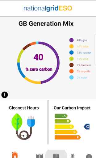
The App allows the user to monitor the generation types that make up your electricity supply and see when the cleanest time to use electricity will be. See the carbon impact level of electricity generation, how your region compares to others in GB and be notified when a record towards decarbonisation breaks.
We welcome feedback about the app and its content. Please contact us at [email protected]. For details on how we calculate the carbon intensity, please visit carbonintensity.org.uk.
About the National Grid ESO:
National Grid ESO – a legally separate business within the National Grid Group – relies on a mix of generation to balance the system and ensure that, whatever the generation mix, electricity is always there when we need it.
Fintan Slye, Director of ESO, said: “In 2018, ESO managed a number of records on the electricity system – including wind generation in Great Britain exceeding 15GW for the first time and no coal on the system for 72 consecutive hours.
“By 2025, ESO will have transformed the operation of Great Britain’s electricity system and put in place the innovative systems, products and services to ensure that the network is ready to handle 100% zero carbon”
Category : Business
Reviews (30)
Good clear information presented in a colourful display. One bug that needs fixing (February 2020) occurs when you start the app in landscape mode and then switch to portrait mode is that the screen resizing fails and part of the display is off screen and can not be viewed. You have to close the app completely and then restart in portrait mode.
Really love this idea. It would be more interesting to kids if we could have some moving graphics, or real time info. I would also like a feature to see the historic power generation mix over previous years. It would also be good to get info on other countries so we can compare. To sum up it's a great idea, a work in progress but on the right path 👍🏽
Good start, improvements awaited. Devs need to get up to speed with standard Android UI practice, including normal ways to dismiss screens. App works poorly on a tablet (bits of-screen) and portrait only. App can not be persuaded to run split-screen on Samsung - the only app that I know with that restriction.
A very cool idea for an app on a functional level. On a design level it's incredibly frustrating that the back button does not dismiss the info windows found throughout the app. Even the video in the "about" page is dead. Idea: 5/5 Implementation: 2/5
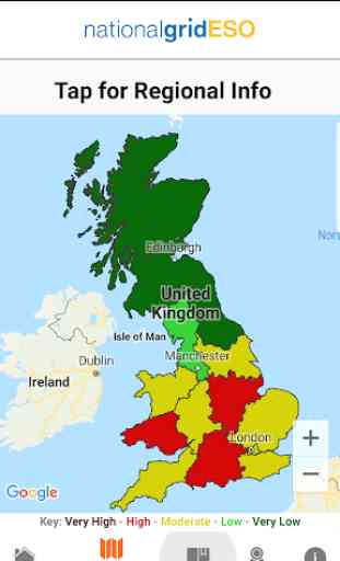
A very interesting app. Only one comment would be on the on the regional info screen, when you tap through to a specific region, the labels for the energy mix are quite difficult to read. Perhaps keep the coloured circles but colour the text labels in black or some other high contrast colour?
Suggested improvements: • Allow items in 'Ranking' to be pop up info as per the map • Make 'When to use' over 24hrs, not 12. • Allow the pop-ins to be dismissed with the back button. • Picking the right area on 'Map' is surprisingly hit and miss, potential bug?
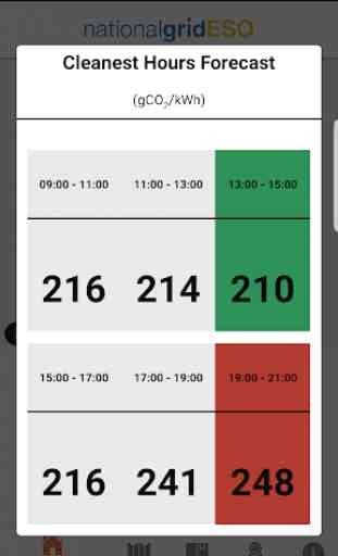
Almost there. To be fully useful, the forecast range needs to cover at least a couple of days. Then it would be excellent at planning the lowest carbon time to charge an EV.
An interesting app. Some of the the legends next to the doughnut charts are hard to read due to the small font and bright, pale colours. Whilst these colours look good in the doughnut darker colours are better for the text.
Great information on the current energy use. A bit slow to respond. Not much use for choosing the greenest period to charge an electric car or use high consumption appliances as the projected period is too short.
Fantastic app - thanks! Is it possible to run the forecast on a regional basis? Clearly lots of differences regionally, so this would be useful to know. Could you also set up alerts for users to know when carbon intensity moves in and out of high and low phases for your local area?
Agree with others that without the 'When To Use' being region based (which it could derive from your postcode - even first three chars - like the web version) it's ineffective at forecasting when to run your appliances/charge your car. Strong offshore wind in NE/Scotland dragging down the national average doesn't tell those in South England when to plug in, as the Regional map makes clear. Checking back every few hours for live data is daft. Presumably the regional forecast data is in there.
Very rough and ready. Developers: enable the back button! Let users tap through to generation mix from the ranking view. Add GW as well as %. Get rid of the slow animations.
This App needs more information including live powercuts as we get a lot of them in my region. It also needs to be much more user friendly.
As others have said short on details but most of all the colours, seldom can I make out the percentage numbers on the weired greey/yellow colour and please increase that font size a little.
Energy flow via interconnectors to-from other countries should be added. Map colours are misleading. Should be higher proportion renewable before map turns green. Would like to see total export from small generators with on-site generation via smart meters. Pumped hydro storage should show power generated versus consumed while pumping.
Great to see this level of detail. Would like to see more specific information by region also, and more explanation why certain times are greener than others and does this change on a daily basis.
OK but not well laid out. Difficult to read quickly, "when to use" section only covers 6am to 6pm. GridCarbon is much clearer but both lack all the info they could have.
Great app. Please would you make the when to use regionsl, and forecast as far and with as much granularity as you can. I'd check that, as i check the weather forecast
Good app, helps you do a little bit to reduce climate change by using appliances when the impact is smaller.
Interesting information, horrible design. Swipe to dismiss cards? Study some Android app design guidelines please. It's also laggy and clunky.
I downloaded the app, an icon appeared on my phone, but when you try to open it, it closes again after about a second.
Seperates gas reliant generation and imports. the generators may be based in britain but they are still fueled by imported gas. Unreliable information makes this a useless app.
Good for a Mk1. Fingers crossed for more depth. Overall a thumbs up.
The 'cleanest energy' times keep moving so it's like, "green energy tomorrow", but tomorrow never comes. So i've given up trying to time my washing cycle to it :(.
Useless... how can I adjust my energy consumption to accommodate current peak usage if I can't find out peak usage?????
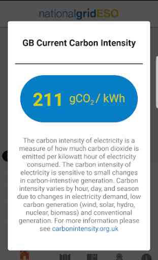
They colour coded Carbon intensity map of the UK clearly shows when electricity is most green.
Cool, tell me the best times to use grid electricity.
Very interesting and vital information for our climate challenged world .
Very good insight into the real energy mix on a regional basis.
Interesting app for checking the UK's or UK region's electricity generation mix at a given point in time. It could be greatly improved by increasing the amount of data on offer, for example the generation mix over the day/week/month/year pie chart, and energy mix over the past 24 hours line graph. Usability needs improving, as it is not immediately clear how to close pop up cards, as there is no close button on the cards and the back button does not work (you have to swipe them to the left).