TradingView - Charts, Quotes, Traders & Investors
hone trading skills to make consistent profits. Freely access charts, stock prices, and financial instruments from global markets. Chat with 8M+ like-minded individuals from the USA, Europe & Asia to be aware of the latest trends.
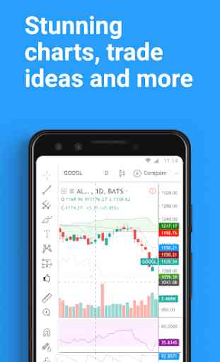
State-of-the-Art Charts
Our stunning charts that outclass many desktop trading platforms are available for free. Stock market charts, crypto charts, forex, futures & indices - all of them are at your fingertips. Select one of many drawing tools & technical indicators (Gann, Elliott Waves, MAs, etc.) to find your edge.
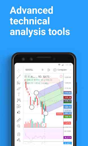
Robust Analytics Platform
Get access to tools for technical analysis that are just as powerful as our web-based charts. Always at your disposal whenever you need it. Discover global stock market trends on the go.
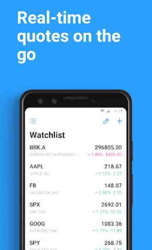
Real-Time Data from the World's Leading Exchanges
Access real-time stock quotes from the largest and most popular exchanges from around the world. And for those who need more - get market data from some exotic exchanges that are supported as well. It doesn’t matter if you are a newbie in stock trading or an experienced investor. We’ve got something for everyone!
Watchlist
Create and customize personal watchlists to see market quotes of the popular stocks, indices of world exchanges or currency pairs from all around the world. Follow favorite ticker symbols & see real-time price updates. Keep your stock watchlist open & never miss out on a trade opportunity again!
Cryptocurrency Trends
Crypto investing is becoming increasingly popular so watch our live bitcoin chart as well as altcoins to know what’s happening in the crypto markets.
Synced Account Info
Your account is fully synced on every device. All changes that you make on the web platform will be in the mobile app and vice versa.
TradingView is your gateway into the world of stock investing, global trading, and market analysis. Discover our trading platform, learn how to invest, and start building your own portfolio!
Category : Finance
Reviews (24)
The app is excellent for analyzing the charts, but I have a problem with the charts... Like 60% of the time they just don't show up when I want to use them .. it's just blank... They only show up after a while, even upto 30mins of waiting and constantly restarting the app... and it always takes me to the app info in my settings everytime I try to save a photo of my chart for some reason.... Hope you can fix this problem, otherwise the app is perfect, and I am currently using your trial version
The last few updates have RUINED this app. The new interface is terrible. You have added unecessary steps in performing basic functions such as drawing trend lines or pulling fibs. There used to be a simple toolbar which was very easy to access rather than a load of iPhone style sub menus. It's just inefficient. I pay for premium tradingview and used to use the app a lot. Is there any way to access old versions of the app interface? Likely will cancel if not. Thanks
For everyone complaining about the new update, it can easily be toggled on/off in your: profile/ settings/ chart/ switch to new toolbars. Every technical analysis / drawing takes one extra step with the new toolbar, and is less intuitive but you get more space on the screen. Doesn't make the app worse, it's just a matter of preference. Both would be perfect though ;)
Great App. I totally love it. It has been helping me minimise my losses. I love the fact that it at least allows you access to 3 indicators for free. Lol. However, I think a payment plan should be added to allow for Nigerians to pay with ease. I wanted to upgrade a few days ago. I tried all my cards. None worked. Can the developers please include a new payment plan please. Maybe like USDT payment or something. Because I badly want to upgrade. I need the paid features! 😁 Thanks in advance.
Such a beautiful platform. Still an amazing app with the improvements they make. One suggestion is for the app, to have an ability to move the trend line points without a giant dot covering the candles and without your thumb or fingers having to cover the area you wanna move without needing magnet for accuracy. The tap hold feature that brings up the dashed cross is great for this very ability, in my opinion. Update: I dont like how inaccessible drawing is on the new app look. It's terrible...
So much efficiency sacrificed for that extra bit of chart space on the screen. Everything requires more clicks to get! We can no longer see the time on the chart (or the timezone). It's harder to switch between timeframes. It's harder to get to the drawing tools. It's harder to do anything! Positive: seems like we can manage alerts on mobile now, that's a good point. But why try hard to be Trendspider? Tradingview is (was) superior.
Thanks for giving the ability to choose between the new streamlined look but being able to have the toolbars enabled back in the settings. I was beginning to lose my cool thinking of how many more gestures would be needed for certain resources, but then seen in the update description it was able to be brought back. I think too many developers think changes will be loved by the entire user base and there is no way to go back to the old way of using an app besides dealing with it.
Terrible! This new update makes it harder to find anything important, it was much easier before this update. Next update PLEASE!!! Prioritize things we use most like indicators, Times Frames, Charts and News, of a tip of a finger or give us the option to have more freedom to customizing our experience, that would be very satisfying. Everybody will have their own strategy, nobody would complain since they could customize their experience, makes it easier for people to maximize income 💰 🤑 💸
I used to like this mobile app. I'm a paid customer, and they've made it worse in it's recent update (3/22). It takes so many clicks now to do things that was easier in the prior release (ie indicators, drawing tools, chart layouts..etc). It's incredibly frustrating to work with this new design. I have no clue why they don't just leave stuff that works alone. Edit: Upon reading similar reviews below, I disabled the toolbar so I can revert back. What a rollercoaster!
This new layout is making my life way harder unnecessarily! Everything I could quickly do with 1 click, I now need 2 clicks! Change time frames? 2 clicks! Switch to log scale? Also 2 clicks! Autosize bars? Also 2 clicks! Come on! I get that you are looking to improve your mobile interface but this new interface is not good at all! I want the old interface back! Suggestion: Make favorites intervals appear on the bottom instead of the top, this will make it a little bit faster to switch.
I have to agree with the recent posts, new design of the app released recently has a very poor usability, i believe that buttons should be placed back on the top, also is quite difficult to find basic options. For example I am still looking how to toggle chart view to auto. Please change it back to the previous one, it was just great!
Not at all happy with the recent update. It is very difficult to find tools to draw upon chart. Unlike previous version, this version looks much complicated. To be honest, didn't like this update at all. But thankfully they have given the option to set the layout in the profile section as it was before. So switching back to old layout.
This app was great before the update. The time frame changes could be easily done. Now its in the bottom of the app and takes longer to change the time frame by first saving them in favorites and then switching completely stupid. Also there is no shortcut for auto scale. Again becomes time consuming to click more buttons to switch the time frames. I would highly recommend to going back to the previous layout of the app.
I gave this new chart a try, it is not faster, steps were added to every feature that I use, like using the drawing tools, hiding and unhiding drawings, changing templates. And that is just for the features that I was finally able to find. I really wish tech companies would leave app layouts the way they are, and instead focus on the functionality of them, like how to receive alerts faster. PS. Please don't do this to the desktop version.
Latest update is just messing everything up making the application unefficient with a lot of features lost in the menu. UI developers Just consider this: If you need to tap the screen 10 times more to find a tool, then it is not a suitable change. Ex:Scroll button for time-frames , saved templates and many more. Why the hell you changed something working just fine ? Very disappointing
As someone who sent hours on TradingView every day I also don't like the new interface. I started enjoying the new time frame controls but the new interface makes all the worth while drawing functions slower to access. I can't even find the button to hide all my drawings simultaneously. What I could do in one click is now an effort. UX downgraded. The update is not helpful for serious users. It's a simplication for casual users and there should be an option to enable the old or new interface.
Used Tradingview for 3 years almost and this update makes it terrible to use unfortunately. Must of tried getting the UI to look too 'clean' but have made the experience that much more complicated and confusing for users. Constantly clicking tabs and opening new menus isn't what you want. The old version was fine. Edit: You guys need to tell people that you can switch between old and new versions in the settings! Would save you a lot of time and bad feedback.
The previous interface was 10x better. Very disappointed. It want to be able to switch between favorite intervals from the main screen... Is there somebody from the design team that actually does trade or actively watch charts? Changed from 2 to 5 stars because I saw the option of going back to the old style toolbar...do not remove this option as well...
New Update ! What's the point when it's not making things easier for you. I go through nifty charts and by toggling between time frames, draw lines. Earlier it was little difficult but now it's became complex now. Taking more time to load too. I feel i didn't serve the purpose of an Update. Sorry TV, terrible update. Need a correction soon. I have a recommendation here, instead of a half screen pop up each time, try get them in a single favourite bar.
Great app until the update, everything is moved and it takes multiple taps to do what you could do in one tap. Everything has been buried in submenus with huge buttons so it has that dumbed-down look. Bear in mind, you can disable the new look in your settings under Chart, and I must applaud the developers for this excellent move of not forcing the change as this is, for many people, a professional app and should not be treated the same as an app for putting stickers on your tiktok videos.
At first I was not impressed with the new update! Made the whole experience frustrating and slow to nagivate when compared with the previous version. Thankfully there is a setting in your profile to revert back to the original tab layout! Profile > Settings > Chart > switch to new toolbars (turn this off) I use the app daily and have not encountered any issues.
The latest update is a disaster, I know your team is doing its best to provide the most satisfactory user experience, but the latest update where you removed the favourite time frames on the screen made switching time frames difficult, you also made it hard to access drawing tools by removing the favourites on the screen of the chart where it is easier to access. Why would you make it so difficult for everyone? The version before the new update was the BEST! Please bring back the older version.
IF IT AIN'T BROKEN, DON'T FIX IT. Great app ruined by current update. There was absolutely no reason to change the UI. Before the update, a simple task like changing the timeframe took just a click, now I have to open that extra window, look at things I have nothing to do with and change it from there. All features are made in that fashion now, pathetic! Wasting my time finding things that took no time before. Please bring back the old format.
7/10 *** Note their latest updates have put buttons in VERY annoying places (scrolling to save layouts / multiple pushes to go through menus to items that use to pop up in windows etc but still very good for basic needs). It's basically the Google of the early 2000s for any kind of trading. Fantastic free options, but for the day / micro or swing trader then premium is well worth the extra. But they should never have moved the layout around like they have with the update. It was a mistake