Zyxx UI - CM12 Theme
* YOU NEED A CM12 OR CM12 BASED ROM WITH THE NEW THEME ENGINE *
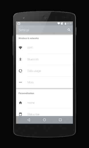
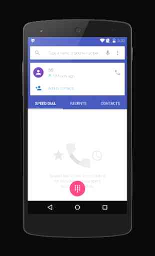
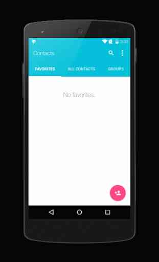
AboutThis beautifully light theme will bring out the best of material UI. This is not an overly intricate theme that will make your device unrecognizable but rather build off the already beautiful material UI. By conjoining the status bar and action bar as well as improving the already beautiful color pallet of lollipop this theme accomplishes its goal by making your device look even better without having to completely transform your device. It also includes a wonderfully elegant font that will make your device look even more beautiful. The icons in the first screenshot are from Vopor.
What's themed:
* Fonts
* Setings
* Dialer
* Contacts
* Calculator
* Downloads
* Play Music
* Play Games
* Play Books
* Play Movies
* Play Store
* Gmail
* Google Plus
* Hangouts
* Google Keep
* SuperSU
* Notifications
* Dialogs
* Boot Animation
* Wallpapers
* Quick Settings
* Cyanogenmod Music
* Cyanogenmod Theme Manager
* Cyanogenmod AudioFX
* Lots More....+ MORE COMING SOON
G+ CommunityIf you are interested in joining our G+ page you can find it below.http://goo.gl/FJlVIc
Category : Personalization
Reviews (29)
First of, fantastic job on this theme AND your other one Elixium UI. However one small thing. Some of the text color can be too light and hard to see in white backgrounds. Its not a deal breaker for me but it would be great if you could fix it in future builds :)
The colors are very nice, this is a beautiful theme. And also the first I've tried which has a Custom Font and Smileys working in Hangouts. All other fonts I've used in Themes made them disappear.
This one is great, I like this theme's font. But text in button and some title label is unreadable using gray as color. I wish you could changed that and make that label color be more darker.
Looks really good. Play music has my favorite theme. The colors are a little pale in the dialogs and in settings app. Please change.
This is the best free theme I've found so far for CM12 but the downside for me in this theme is the bright color of the text in settings for an example that make it very hard to read when the brightness is not the highest.
Just as good as your other cm12 theme, Elixium ui theme. Just wondering is the only difference so far just the theme style being dark and light? Because so far I've only seen those 2 that are different. As always good job and keep up the nice work.
Can you add support for blisspop rom please . It has two extra menus in setting , bliss interface and equalizer which do not get themed
Well that's it. I've found that sometimes the font doesn't apply properly in whatsapp, but I think it's a bug with cm themer and not this
This is my new default UI mixed with your other CM theme Elixium UI. Keep up the good work!
The only thing this needs is a keyboard theme! I would gladly buy the donate version if the google keyboard was themed. Great theme overall!
Is there any way you can theme those two extra icons in the BlissPop ROMs? They're honestly the only thing annoying me, your themes are very materialistic and flat and don't have any unnecessary stuff. Make the phone so beautiful.
Great!! Love the colors, although some setting icons are not themed on euphoriaOS 1.1, other than that very pleasing in the eyes.
What I'd like to see: More coherence in terms of status bar vs header/top bar colour (would love them to be the same, like it is for Google Plus) for all apps and a light Roboto font instead of this iPhone one.
By far, the best theme on Google Play. Although it would be nice to make some selection boxes a bit darker or bluish.
Experienced boot loop and then finally had to restore my backup from TWRP. Device - HTC816w running CM12.1 build : 20150610 May be it does not work with CM12.1. Not sure as the developer has not particularly mentioned it.
My favorite theme for CM12. Thoughtfully designed in every aspect. Only thing I felt the need to change was the blah wallpaper but no marks off for an easy fix. Thank you!
Best free theme on the market. Refreshing to have a light theme instead of all this darkness all the time.
Looks great on my S3. Font fully legible and loving the color palette.
Overall experience is good, but settings UI is not looking good. Change the color pls
Its perfect , 4 stars only coz personally I'm not a big fan of white themes
Love the flat style. Noticed that the BlissPop interface is still stock (icons are not themed) and the Privacy icon in settings is full white and not machine the font color. Aside from that, this is fantastic!
This is by far one of the best themes I've downloaded good job dev! I like how you blended the navigation color in the settings it makes it stand out more
but in the Settings menu Gestures, Lock screen and Mobile Network are still in green.
I love the design. This theme will be perfect if you fix the bug of showing Vietnamese word. And can you change the color of Settings? Anyway, this theme ROCKS :))
I like all except the words are very faded
It's minimal love the theme overall nicely done Dev.
And it's free!
love your 3 themes, please make more <3
I found this theme to be better than any other free theme for CM12. There are a few rough edges though. The toggle color needs to be changed to better differentiate b/w on and off, esp in notification drawer. Also, not all apps (messages and settings) have the blended status bar, thereby breaking overall aesthetic. It'd be great if these two issues can be fixed.